
Monterey Bay Aquarium Visitor Map
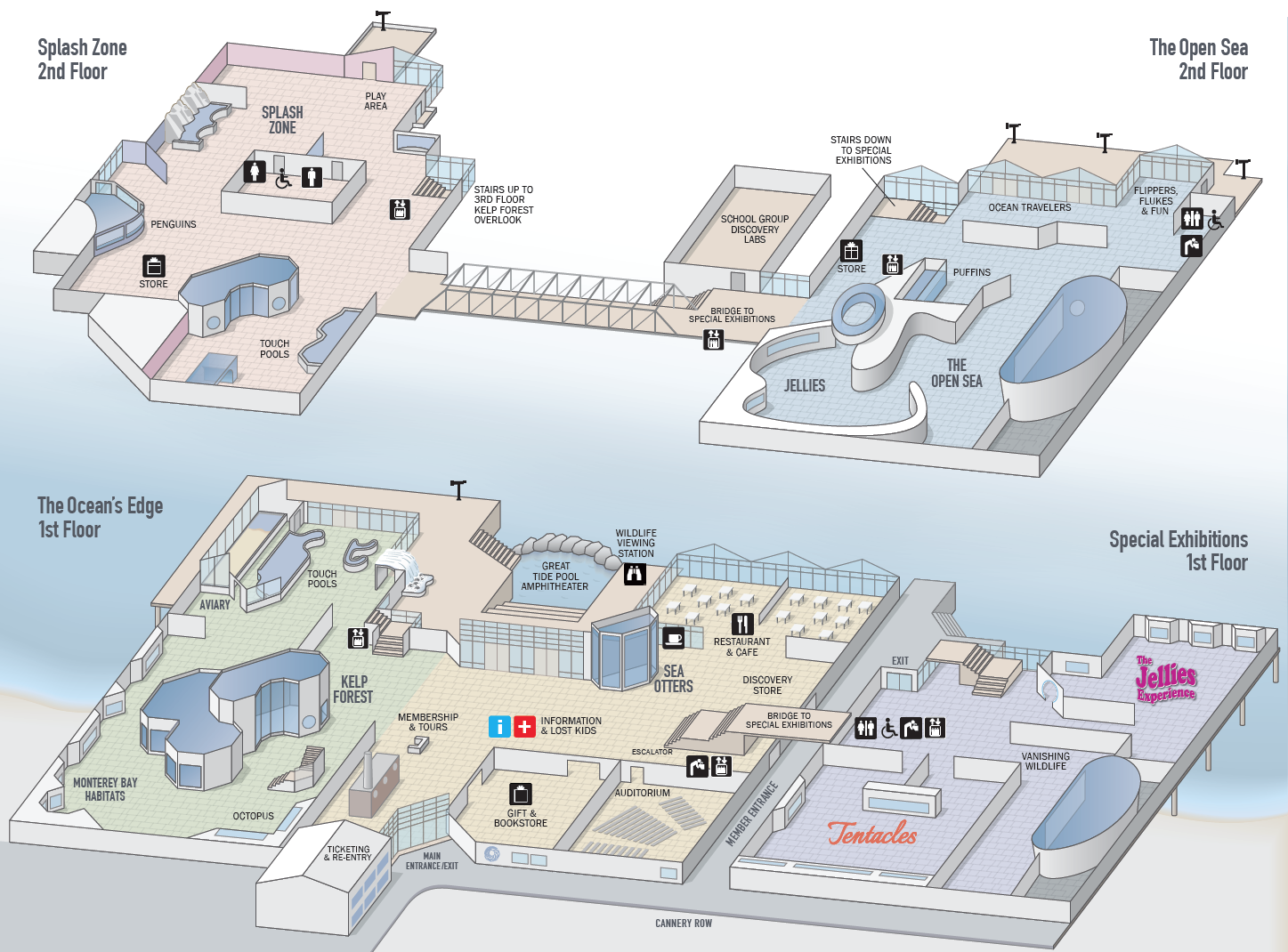
A good visitor map should not only include and identify the main elements a visitor is likely to be drawn to, but it should not be so all-inclusive that it becomes overly complex and confusing. It should do this while remaining attractive in its use of color, typography and iconography. And it should be fun.
This was a problem for the Monterey Bay Aquarium’s visitor map as it existed in late 2013. That was when their marketing department reached out to me for a proposal to redesign their map to be less complex, more pleasant to the eye, and easy to understand and navigate. I worked directly with the Aquarium staff to select the elements that were important to locate and identify, both visually and with type. We developed style sets for color and typography that aided in navigation.
In early 2014 the new map was completed and sent to production. It is in use today.
Client: Monterey Bay Aquarium
Software: Adobe Illustrator